✅ CSS 추가
index.html에 class를 먼저 추가해줍시다.
<!DOCTYPE html>
<html lang="en">
  <head>
    <meta charset="UTF-8" />
    <meta name="viewport" content="width=device-width, initial-scale=1.0" />
    <title>Todo List</title>
    <link rel="stylesheet" href="style.css" />
  </head>
  <body>
    <h1 class="title">Todo List</h1>
    <div class="input-box">
      <input id="todo" class="todo-input" type="text" />
      <button id="addBtn" class="add-btn"></button>
    </div>
    <div id="todoBox" class="todo-box"></div>
    <script src="script.js"></script>
  </body>
</html>
script.js 코드를 수정해줍시다.
const todo = document.querySelector("#todo");
const addBtn = document.querySelector("#addBtn");
const todoBox = document.querySelector("#todoBox");

addBtn.addEventListener("click", () => {
  const newTodo = document.createElement("label");
  const checkBox = document.createElement("input");
  const checkMark = document.createElement("span");
  const rmBtn = document.createElement("button");

  newTodo.className = "new-todo";
  newTodo.innerText = todo.value;
  checkBox.type = "checkBox";
  checkMark.className = "check-mark";
  rmBtn.className = "rm-btn";

  newTodo.appendChild(checkBox);
  newTodo.appendChild(checkMark);
  newTodo.appendChild(rmBtn);
  todoBox.appendChild(newTodo);

  todo.value = "";

  checkBox.addEventListener("change", () => {
    newTodo.classList.toggle("check");
  });

  rmBtn.addEventListener("click", (event) => {
    todoBox.removeChild(event.currentTarget.parentNode);
  });
});newTodo를 label 태그로 변경하고
text 대신 checkMark로 span 태그를 변경합니다.
newTodo, checkMark, rmBtn에 class 이름을 지정해줍니다.
style.css 파일 코드를 작성해봅시다.
* {
  margin: 0;
  padding: 0;
  box-sizing: border-box;
}

body {
  display: flex;
  width: 100vw;
  height: 100vh;
  flex-direction: column;
  justify-content: center;
  align-items: center;
  background-color: lightgray;
}
* 태그를 사용하여 모든 태그의 마진과 패딩을 지워준 뒤
box-sizing을 border-box로 해줍니다.
body 태그에는 width와 height를 화면에 꽉 차게 만들어주고
내부 태그들을 세로(flex-direction: column)로 배치시킵니다.
.title {
  margin-bottom: 20px;
}

.input-box {
  display: flex;
  justify-content: space-between;
  width: 500px;
  height: 25px;
  margin-bottom: 10px;
}

.todo-input {
  width: 450px;
  border: 2px solid #000;
}
title, input-box, todo-input 클래스의 css를 추가해줍니다.
.add-btn {
  position: relative;
  width: 25px;
  height: 25px;
  border: 2px solid #000;
  background-color: #000;
  color: #fff;
  font-size: 25px;
  line-height: 25px;
  cursor: pointer;
}

.add-btn::after {
  position: absolute;
  display: inline-block;
  top: -1px;
  left: 3px;
  font-size: 25px;
  content: "\002B";
}
add-btn 클래스의 css를 설정해줍니다.
add-btn은 25픽셀의 정사각형이고 내부에는 "+" 값을 가지고 있습니다.
after 가상선택자를 사용하여 "+"를 텍스트가 아닌 특수문자로 넣어줍니다.
CSS Entities
W3Schools offers free online tutorials, references and exercises in all the major languages of the web. Covering popular subjects like HTML, CSS, JavaScript, Python, SQL, Java, and many, many more.
www.w3schools.com
위의 사이트에서 css에서 content를 통해 특수문자를 사용할 수 있는 리스트를 확인할 수 있습니다.
.todo-box {
  width: 500px;
  height: 400px;
  padding: 10px;
  border: 2px solid #000;
  background-color: #eee;
}todo가 추가될 todo-box 클래스 css입니다.
.new-todo {
  display: block;
  position: relative;
  height: 25px;
  padding-left: 35px;
  margin-bottom: 12px;
  cursor: pointer;
  font-size: 22px;
  -webkit-user-select: none;
  -moz-user-select: none;
  -ms-user-select: none;
  user-select: none;
  line-height: 25px;
}
새로 추가되는 todo의 new-todo 클래스 css입니다.
user-select 속성을 통해 드래그를 방지합니다.
브라우저에 따른 user-select 속성을 모두 방지하기 위해 4개의 속성 모두 none으로 설정해줍니다.
.new-todo input {
  position: absolute;
  opacity: 0;
  width: 0;
  height: 0;
  cursor: pointer;
}
기존에 생성한 input을 보이지 않게 설정합니다.
후에 우리는 새로운 input 태그를 만들어 custom할 예정입니다.
.check-mark {
  position: absolute;
  top: 0;
  left: 0;
  width: 25px;
  height: 25px;
  border: 2px solid #000;
  background-color: #fff;
}input을 대신 할 check-mark 클래스입니다.
.check {
  text-decoration: line-through;
}

.new-todo .check-mark::after {
  display: none;
  position: absolute;
  left: 7px;
  top: 3px;
  width: 5px;
  height: 10px;
  border: solid white;
  border-width: 0 3px 3px 0;
  -webkit-transform: rotate(45deg);
  -ms-transform: rotate(45deg);
  transform: rotate(45deg);
  content: "";
}
check 클래스는 checkBox를 클릭했을 경우 추가되는 클래스입니다.
할 일을 했다고 표현하기 위해 글씨에 취소선을 추가합니다.
check-mark 클래스의 가상 선택자를 사용하여 체크 표시를 만들어줍니다.
우선은 보이지 않게 display를 none으로 설정합니다.
width와 height를 지정하여 작은 직사각형을 만들고
border-width를 사용하여 오른쪽과 아래쪽만 테두리를 그려줍니다.
그 후, transform을 사용하여 45도 회전시킵니다.
모든 브라우저에서 호환되도록 3개의 속성을 설정해 45도 회전시킵니다.
.rm-btn::after {
  position: absolute;
  right: 5px;
  top: 0px;
  display: inline-block;
  font-size: 30px;
  cursor: pointer;
  content: "\00d7";
}

.rm-btn:hover {
  color: red;
}
rm-btn 클래스에도 content를 사용하여 특수문자로 "x"를 추가해줍니다.
마우스를 올려놓았을 때(hover) 색을 빨간색으로 변경하여 취소를 할 수 있다고 알려주도록 설정합시다.
✏️ 최종 style.css 코드
* {
  margin: 0;
  padding: 0;
  box-sizing: border-box;
}

body {
  display: flex;
  width: 100vw;
  height: 100vh;
  flex-direction: column;
  justify-content: center;
  align-items: center;
  background-color: lightgray;
}

.title {
  margin-bottom: 20px;
}

.input-box {
  display: flex;
  justify-content: space-between;
  width: 500px;
  height: 25px;
  margin-bottom: 10px;
}

.todo-input {
  width: 450px;
  border: 2px solid #000;
}

.add-btn {
  position: relative;
  width: 25px;
  height: 25px;
  border: 2px solid #000;
  background-color: #000;
  color: #fff;
  font-size: 25px;
  line-height: 25px;
  cursor: pointer;
}

.add-btn::after {
  position: absolute;
  display: inline-block;
  top: -1px;
  left: 3px;
  font-size: 25px;
  content: "\002B";
}

.todo-box {
  width: 500px;
  height: 400px;
  padding: 10px;
  border: 2px solid #000;
  background-color: #eee;
}

.new-todo {
  display: block;
  position: relative;
  height: 25px;
  padding-left: 35px;
  margin-bottom: 12px;
  cursor: pointer;
  font-size: 22px;
  -webkit-user-select: none;
  -moz-user-select: none;
  -ms-user-select: none;
  user-select: none;
  line-height: 25px;
}

.new-todo input {
  position: absolute;
  opacity: 0;
  width: 0;
  height: 0;
  cursor: pointer;
}

.check-mark {
  position: absolute;
  top: 0;
  left: 0;
  width: 25px;
  height: 25px;
  border: 2px solid #000;
  background-color: #fff;
}

.check {
  text-decoration: line-through;
}

.new-todo .check-mark::after {
  display: none;
  position: absolute;
  left: 7px;
  top: 3px;
  width: 5px;
  height: 10px;
  border: solid white;
  border-width: 0 3px 3px 0;
  -webkit-transform: rotate(45deg);
  -ms-transform: rotate(45deg);
  transform: rotate(45deg);
  content: "";
}

.new-todo input:checked ~ .check-mark {
  background-color: #000;
}

.new-todo input:checked ~ .check-mark::after {
  display: block;
}

.rm-btn::after {
  position: absolute;
  right: 5px;
  top: 0px;
  display: inline-block;
  font-size: 30px;
  cursor: pointer;
  content: "\00d7";
}

.rm-btn:hover {
  color: red;
}
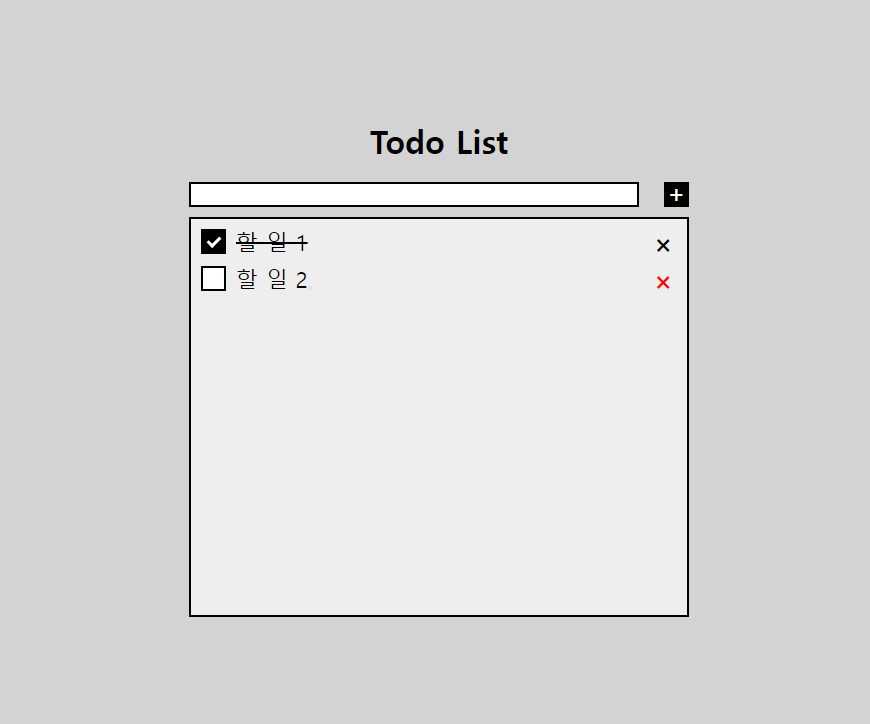
이상으로 자바스크립트를 사용하여 투두 리스트를 간단하게 만들어 보았습니다!
'실습 > JavaScript' 카테고리의 다른 글
| [JavaScript] 투두 리스트(Todo-List) 만들기 (2) (0) | 2023.12.28 |
|---|---|
| [JavaScript] 투두 리스트(Todo-List) 만들기 (1) (0) | 2023.12.28 |